
Do Not Read This - Poster Design
Deliverables
Poster Design
Users/Audience
Book Readers
Intellectuals
Activists
My contributions
Book Cover Design
Team Members
Solo Project
Details
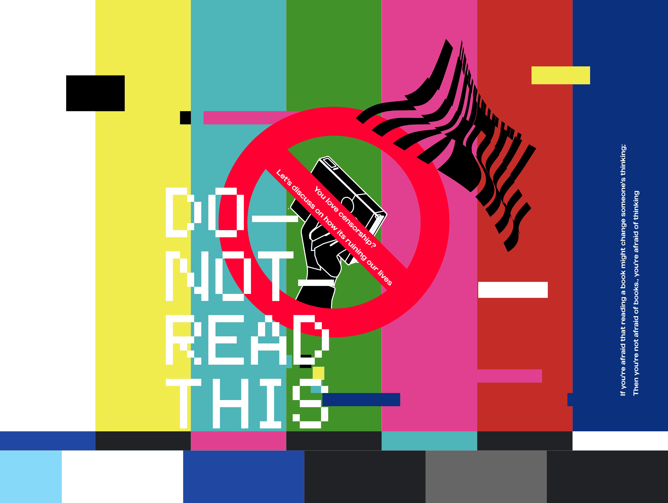
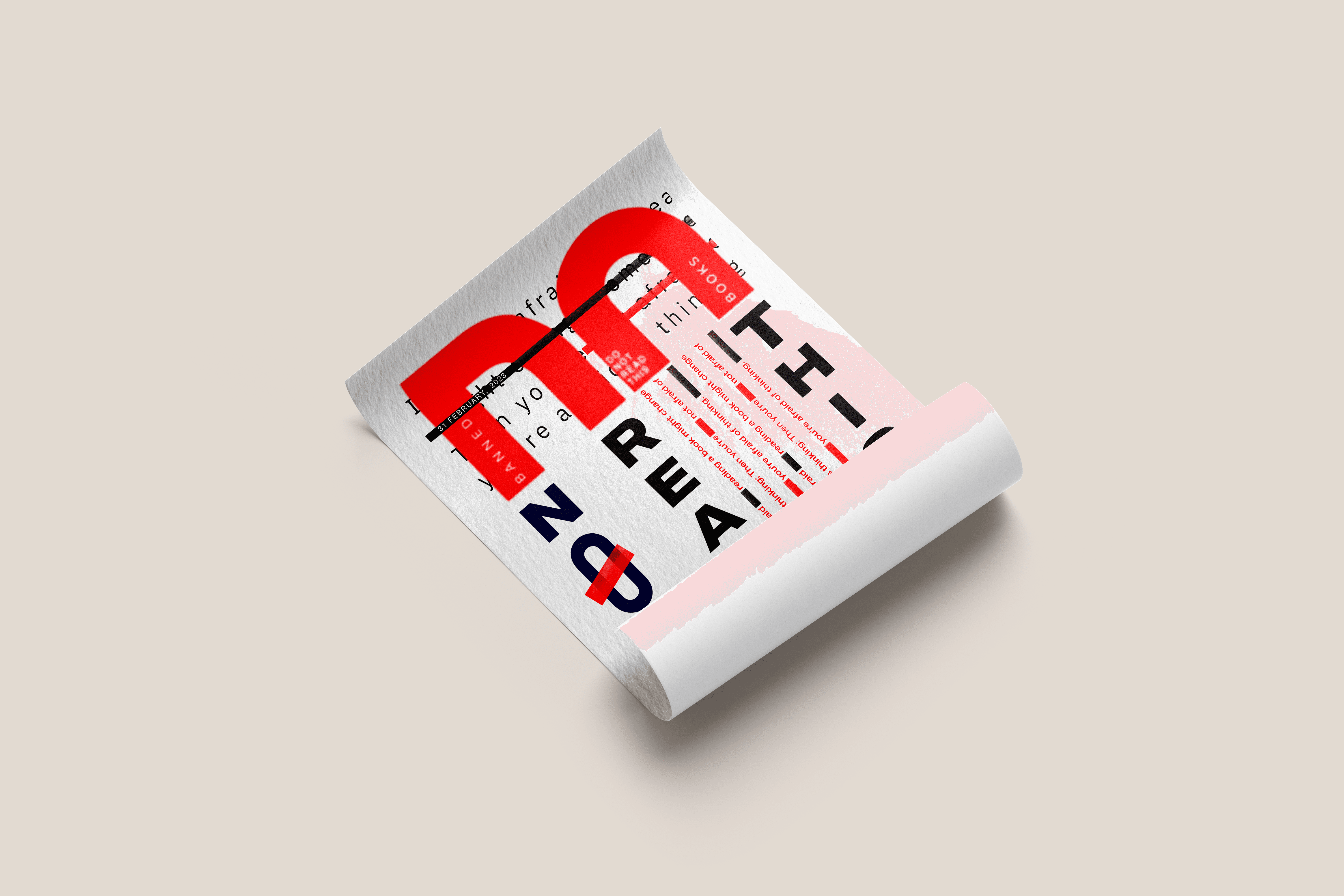
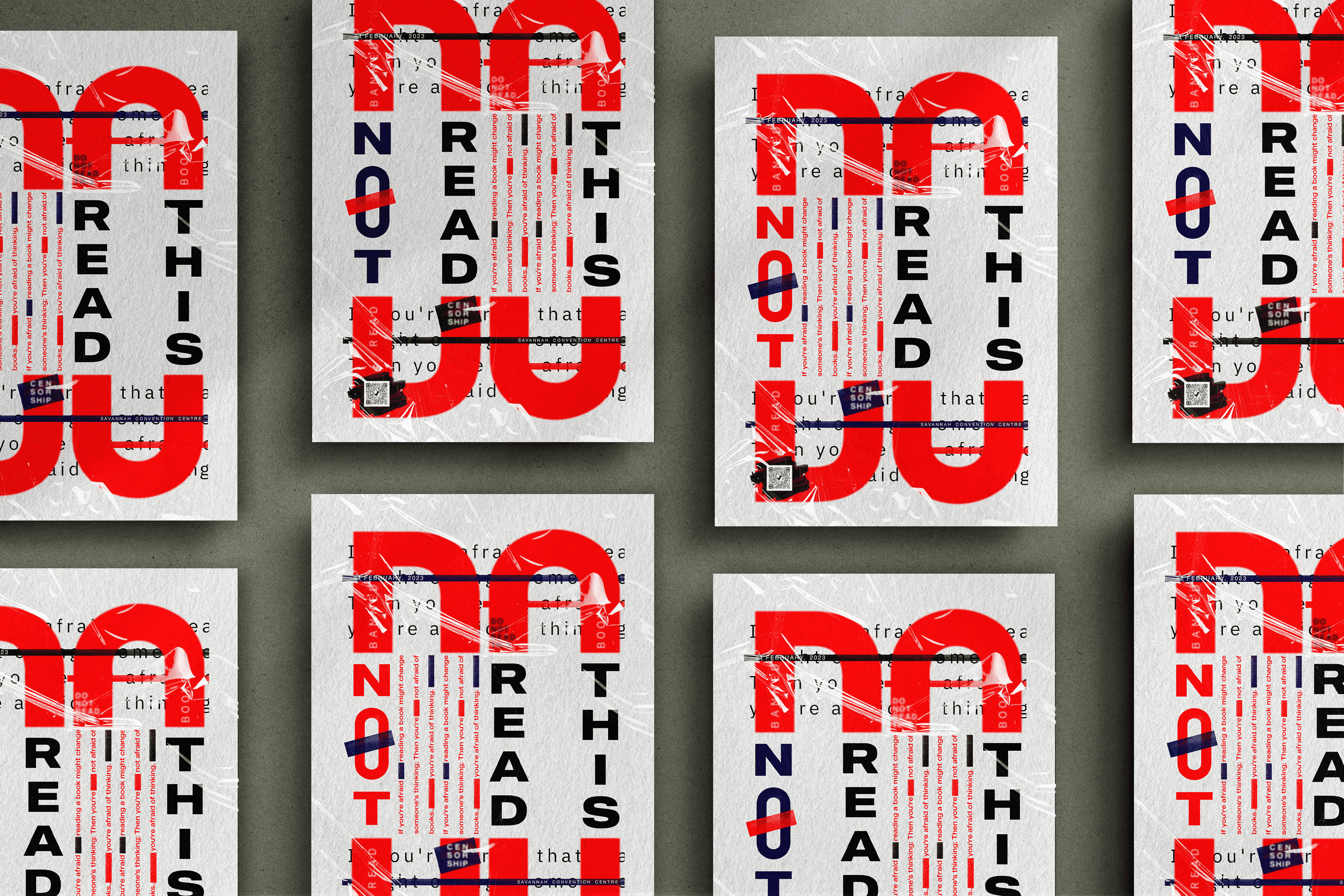
"Do Not Read This" is a typographic poster design for an event promoting the importance of reading banned books. The project challenges censorship and advocates for intellectual freedom through bold, thought-provoking typography. After multiple iterations, the final two posters were designed to best convey the event’s message.


Challenges
Balancing readability with conceptual distortion was key. The design needed to symbolize restriction without making the message unclear. Creating a strong visual hierarchy and maintaining consistency across variations were also major challenges.
Pain Point
The biggest hurdle was achieving the right level of text distortion to reflect censorship without losing clarity. Integrating censorship motifs like strikethroughs and redactions while maintaining visual appeal required careful refinement.
Solution
An iterative approach helped strike a balance between obstruction and readability. Strategic use of color, overlays, and typography created a censored yet compelling visual. The red and black theme reinforced urgency, while layering techniques evoked suppression.
User Research
Feedback from designers and book enthusiasts helped refine legibility while preserving the rebellious, censored aesthetic. Iterations improved clarity and impact, ensuring the message remained strong and engaging.


Conclusion
The final design captures the urgency of reading banned books while making a bold statement against censorship. Through layered typography and strategic design, the poster sparks curiosity, promotes intellectual freedom, and reinforces the event’s purpose.
