
Angkor Wat - Book Cover Design
Deliverables
Book Cover Design
Users/Audience
Book Readers
Collectors
My contributions
Book Cover Design
Team Members
Solo Project

Details
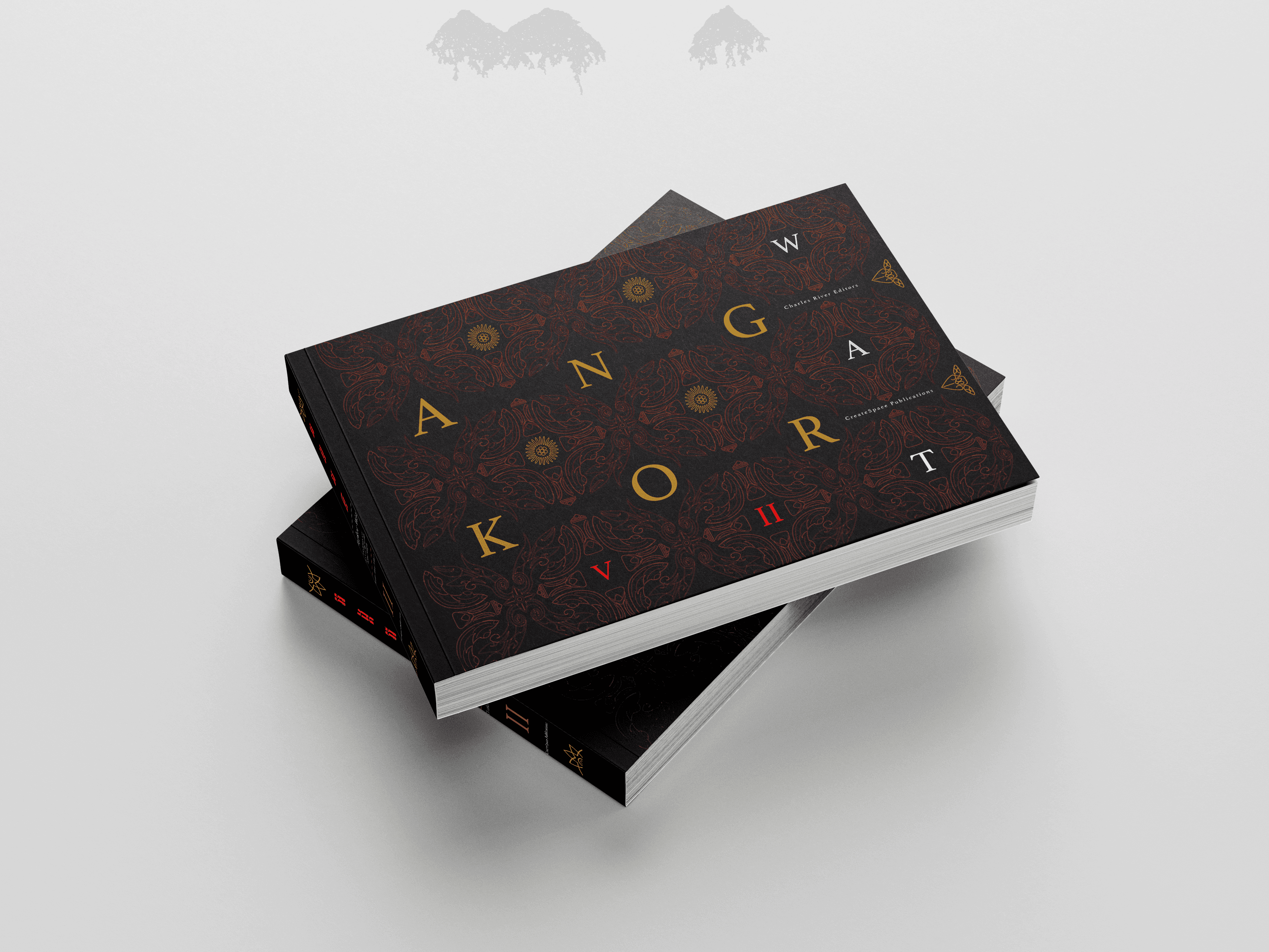
The Angkor Wat book cover redesign project aimed to reimagine an existing cover using only typography. The objective was to create a design that reflects the temple’s historical and cultural significance while maintaining a strong visual hierarchy and readability. The project emphasized the use of type as the primary design element, experimenting with form, spacing, and composition to evoke the grandeur of Angkor Wat.

Challenges
One of the main challenges was conveying the intricate and monumental essence of Angkor Wat without relying on imagery. Achieving a balance between modern typography and the traditional aesthetic of the temple required careful font selection and manipulation. Ensuring legibility while maintaining an artistic expression also posed a challenge, especially when experimenting with complex type arrangements.
Pain Point
Finding a typeface that resonated with the architectural and cultural aspects of Angkor Wat was a key pain point. Additionally, avoiding visual monotony without the aid of imagery required a creative approach to layout and typography. Striking the right balance between minimalism and historical depth proved to be a recurring design hurdle.
Solution
To overcome the challenges, a carefully selected typeface was used that reflected the historical and architectural significance of Angkor Wat. Type manipulation techniques, such as spacing, layering, and subtle distortions, were applied to evoke the grandeur of the temple. A balanced composition was achieved by experimenting with hierarchy and contrast, ensuring readability while maintaining a strong visual impact. By refining typographic elements and layout, the final design successfully conveyed the essence of Angkor Wat without relying on imagery.
User Research
Research involved analyzing existing book covers related to historical landmarks and architectural studies. Understanding how typography alone can communicate a sense of place and history was essential. Feedback from peers and potential readers helped refine the design, ensuring clarity, visual appeal, and alignment with the subject matter.


Conclusion
This project demonstrated the power of typography in storytelling and visual communication. By using type as the sole design element, the final cover captured the historical and cultural significance of Angkor Wat in a modern yet respectful way. The process reinforced the importance of research, experimentation, and iteration in design, proving that strong typography can be just as effective as imagery in conveying meaning and emotion.
